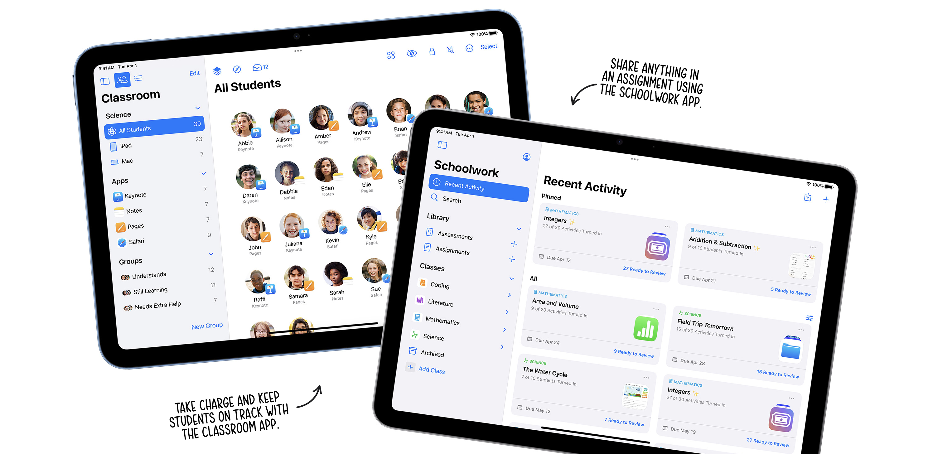
This case study discusses public product context and my contribution at a systems level. Internal strategy, unreleased designs, research details, implementation specifics, roadmaps, and performance outcomes remain protected under NDA.
Overview
I designed a shared product foundation for Apple's Education apps, Schoolwork and Classroom, as they moved into the Liquid Glass design language. My work focused on creating a coherent system of foundations, components, interaction patterns, and guidance that could support two established products without erasing the distinct jobs each one performs for teachers and students.
Product context
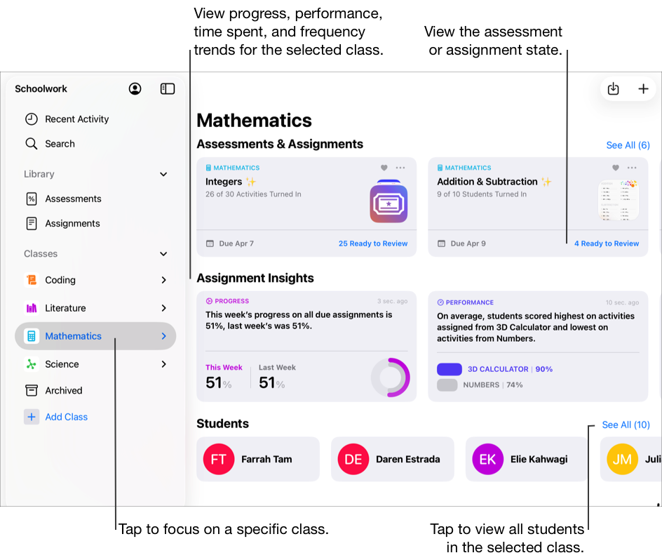
Schoolwork and Classroom sit beside one another in the teaching experience, but they solve different problems. Schoolwork helps teachers create assignments and assessments, distribute activities, collaborate with students, review work, and understand progress over time. For students, it provides a central place to see what is due, submit work, and follow their own progress.
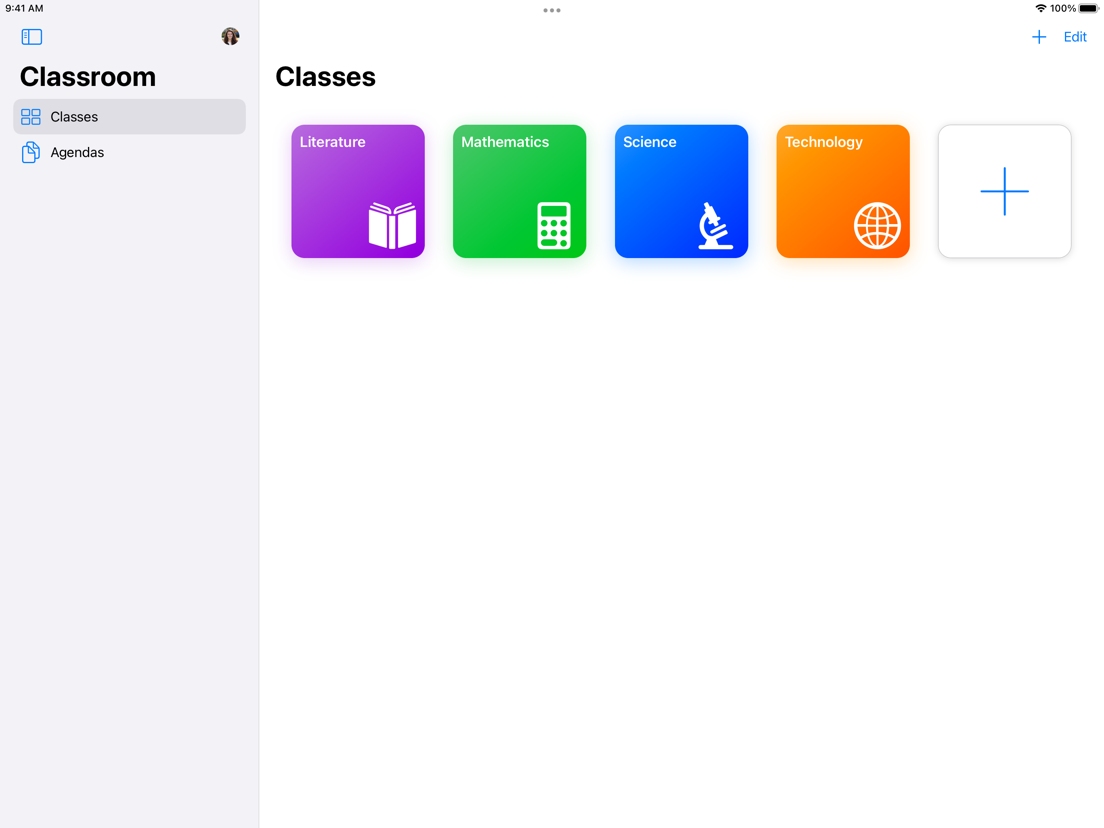
Classroom supports the live lesson. A teacher can organize classes and groups, guide students into an app or website, share materials, view screens with clear student awareness, present work, and help a room move through an agenda together.
That relationship made consistency valuable, but sameness would have been the wrong goal. The system needed to feel unmistakably part of one Apple Education family while respecting the difference between planning learning over time and orchestrating it in the moment.

Schoolwork brings assignments, assessments, insights, and student progress into one class view. Public product view from Apple’s Schoolwork User Guide.

Classroom organizes the spaces a teacher enters before guiding a live session. Public product view from Apple’s App Store listing.
The challenge
Both apps had years of product history, established workflows, and a broad range of UI states. A visual refresh alone would not create durable alignment. Without a shared model, similar decisions could continue to be solved independently, causing small differences in hierarchy, behavior, terminology, and state handling to accumulate over time.
Liquid Glass also introduced a new material and depth language. The design task was not to make every surface glass. It was to determine where material could clarify hierarchy and navigation, where content needed to remain visually quiet, and how the experience could retain legibility across dense classroom information.
The central question became: how might a shared system make both apps feel more coherent and easier to evolve while protecting the specialized workflows that make each product useful?
Build one design language, not one flattened product.
My role
My contribution centered on the system connecting the products. I audited existing UI patterns, mapped where the apps converged and diverged, identified reusable foundations, and translated the emerging visual direction into component and interaction guidance that product teams could apply consistently.
The work moved between detail and structure. At one level, I examined spacing, typography, materials, controls, states, and content density. At another, I defined how those decisions should be organized, named, documented, and extended so the system could remain useful beyond a single release.
Because the underlying project is confidential, this case study focuses on the approach and public product context rather than unpublished screens or internal decisions.
Audit & synthesis
I began by treating both applications as one pattern landscape. I cataloged repeated structures, compared their visual and behavioral differences, and grouped them by the job they performed rather than by the screen where they happened to appear.
The audit separated true product requirements from historical variation. Some differences reflected genuinely distinct teaching contexts; others represented parallel solutions to the same interaction. That distinction helped identify what could become a shared component, what needed a configurable variant, and what should remain product-specific.
I also looked beyond the default state. Education software has consequential loading, empty, offline, permission, progress, selection, review, and multi-user states. A component is only reusable when its behavior remains coherent through those less-visible moments.

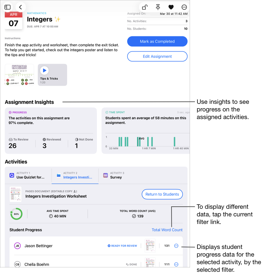
A Schoolwork assignment combines instructional content, aggregate insight, activity detail, and individual student status. Public product view from Apple’s Schoolwork User Guide.

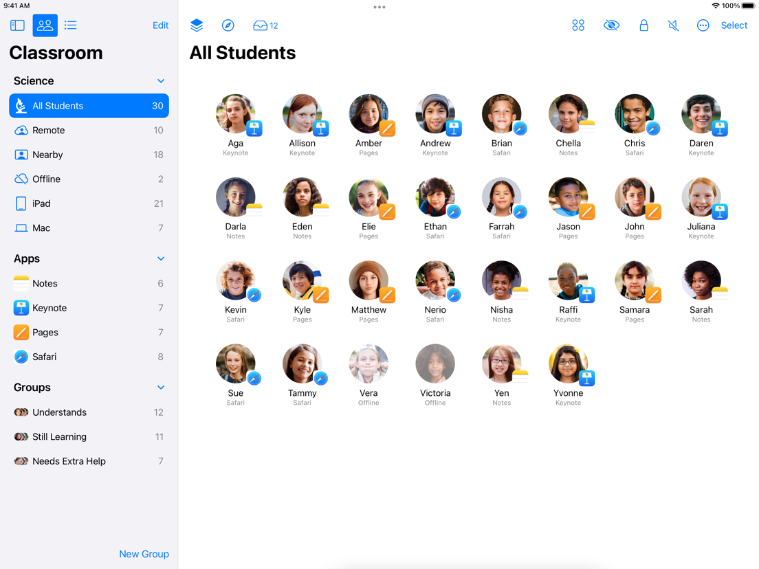
A live Classroom session must make many student and device states glanceable without overwhelming the teacher. Public product view from Apple’s App Store listing.
System architecture
I organized the work in layers so teams could reason from a shared foundation instead of copying isolated screens.
Foundations established the visual grammar: color roles, typography hierarchy, spacing, shape, material, elevation, icon treatment, and motion principles. Components turned those decisions into reusable controls and content structures. Patterns explained how components should work together for recurring jobs such as navigation, selection, creation, review, progress, and classroom orchestration.
The final layer was guidance. A library alone can show what exists, but guidance explains why a pattern exists, when to use it, when not to use it, which properties may vary, and what behavior must remain consistent. That rationale is what helps a system survive new features and new contributors.
Liquid Glass
I treated Liquid Glass as an interaction material rather than decoration. Its strongest role was at boundaries: navigation, toolbars, overlays, and controls that needed to remain present while content moved beneath them.
Dense educational content required restraint. Assignments, assessments, student work, progress, and live device states already carry significant visual information. The system needed to preserve strong content hierarchy, predictable grouping, and readable contrast instead of allowing material effects to compete with the work itself.
This led to a practical principle: use depth to communicate behavior, then let content surfaces stay calm. The material should help someone understand what is persistent, interactive, or layered—not simply announce the new visual language.
Designing for density
Schoolwork and Classroom both ask users to scan a large amount of changing information. Teachers need to distinguish classes, activities, students, completion states, device states, progress, and exceptions quickly. The hierarchy therefore had to work before color or material was applied.
I used consistent alignment, semantic grouping, restrained emphasis, and predictable placement to lower the cost of scanning. Repeated information was kept visually stable; exceptional information earned contrast. This helped the same system support both broad overviews and focused detail without turning every data point into a competing signal.
The system also had to accommodate names, localized strings, variable class sizes, and content authored by teachers and students. Flexible layout behavior was treated as part of the component definition rather than a later implementation concern.

Assessment results balance summary, review status, analytics, and individual responses. Public product view from Apple’s Schoolwork User Guide.

Classroom’s screen view makes active work and connectivity states visible during a live session. Public product view from Apple’s App Store listing.
Interaction states
Shared components needed to communicate more than their visual style. I considered state transitions, selection behavior, focus, disclosure, confirmation, disabled conditions, loading, errors, and the relationship between direct manipulation and explicit actions.
Classroom interactions can affect an entire room or an individual student device, while Schoolwork actions may publish, return, score, schedule, or alter learning materials. The system therefore needed clear action hierarchy and state feedback, especially where an accidental tap could interrupt instruction or change student-facing content.
Motion was used to preserve context: showing where content came from, what changed, and what remained available. The goal was confidence and continuity rather than animation for its own sake.
Accessibility
Accessibility was treated as a property of the system, not a checklist added after component design. Hierarchy could not depend on color alone, controls needed meaningful states and sufficiently clear targets, and materials needed to preserve contrast as content changed behind them.
The component model also had to remain understandable with larger text, alternate input methods, keyboard and focus navigation, and localized content. Designing these behaviors at the system level reduces the chance that every feature team has to rediscover the same accessibility requirements independently.
In an education context, this matters twice: the products support teachers working under time pressure and students with a wide range of abilities, environments, and device configurations.
Collaboration
A shared system is a coordination tool as much as a design artifact. I worked across product contexts, using comparisons and reusable examples to make decisions concrete and expose where apparently similar workflows had different requirements.
Rather than presenting a finished library all at once, I used iterative reviews to test the model against real product situations. Feedback from design and engineering helped reveal missing states, overly rigid assumptions, and places where a shared component needed configuration instead of duplication.
Documentation captured both the decision and its rationale. This made review conversations more durable and gave future contributors a starting point for extending the system without relying on institutional memory alone.
Tradeoffs
The most important tradeoff was consistency versus specificity. A system can become easy to govern but hard to use if it forces unlike workflows into the same shape. Conversely, unlimited exceptions preserve local flexibility while recreating fragmentation.
I used a simple test: if two patterns shared purpose, behavior, and state logic, they belonged in the common system. If they only looked similar, they needed further investigation. If a difference reflected the teaching workflow itself, the system should preserve it intentionally.
Another tradeoff was ambition versus adoption. A useful system has to meet teams where the product is today while giving them a credible path forward. The work therefore balanced new visual language with existing behavior, implementation realities, and the need for gradual integration.
Outcome
The work established a shared vocabulary for discussing Schoolwork and Classroom, a clearer model for deciding what should be common or product-specific, and a reusable foundation for applying the new visual language with greater consistency.
Its value was not limited to a set of components. The system created a decision framework: teams could compare new work against shared principles, identify when a variant was justified, and carry accessibility and state behavior forward with less reinvention.
Specific product metrics and implementation outcomes remain confidential, but the broader result was a foundation designed to make future product work more coherent, scalable, and deliberate.
Reflection
This project reinforced that design systems are most valuable when they encode judgment, not only appearance. Tokens and components create consistency; principles and rationale create adaptability.
Working across two mature products also sharpened my understanding of systems as negotiated infrastructure. The strongest solution is not the one with the fewest variants. It is the one that makes necessary differences explicit, removes accidental differences, and gives teams a dependable way to make the next decision.
The work continues to shape how I approach product design: begin with the real job, study the states around it, build the smallest coherent rule, and document enough of the reasoning that the system can grow without losing its intent.