Overview
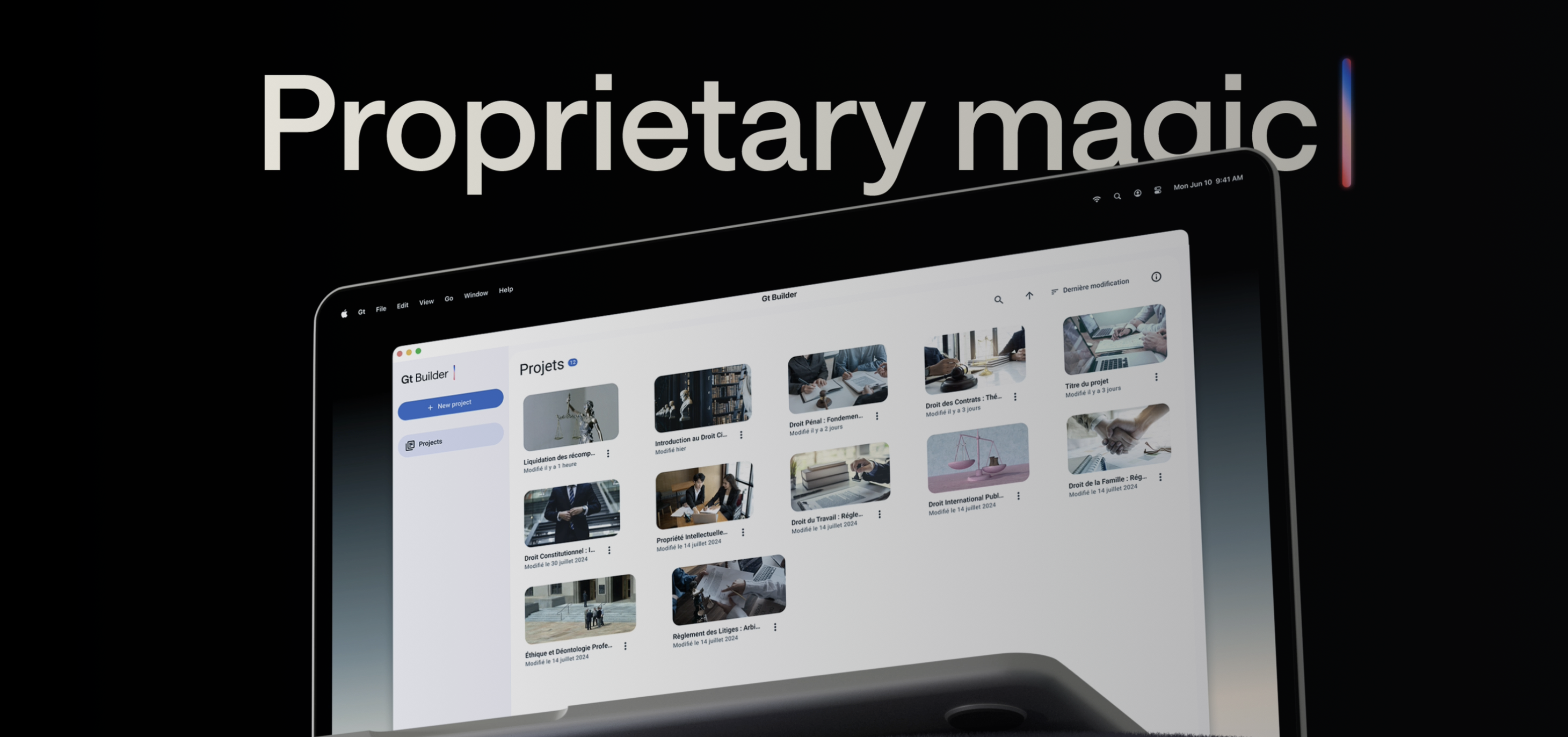
This case study explores the usability challenges within GTai Course Builder, Gutenberg Technologies' platform for creating AI-driven learning experiences. Using Tobii eye-tracking and Hotjar behavioral analytics, I conducted a mixed-methods usability assessment to uncover how real users navigate, interpret, and interact with key features. The study revealed several navigation bottlenecks, unclear interface elements, and moments of cognitive overload that slowed users' ability to complete essential course-building tasks. By mapping gaze patterns to interaction data, I identified the specific UI components that caused confusion and the opportunities with the highest design impact. This research ultimately informed a set of targeted recommendations aimed at improving clarity, reducing friction, and supporting a more intuitive content-creation workflow.
How can GTai Course Builder better support users in efficiently creating and managing AI-generated course content?
Context
GTai, a client of ours, develops AI-powered tools for creating and managing educational content. While the platform offers powerful features, users face challenges navigating complex workflows, unclear interface elements, and cognitive overload that slow down course creation and reduce efficiency. The overarching goal was to identify these pain points and propose actionable improvements to enhance the user experience.
This case study walks through the end-to-end UX research process behind evaluating GTai Course Builder, from defining the research goals to conducting eye-tracking and behavioral analytics studies, synthesizing insights, and translating findings into actionable design recommendations.
Research methodology
We ran 8 one-on-one usability sessions, each lasting approximately 45 minutes to 1 hour, where participants completed a variety of realistic scenarios and tasks designed to mirror actual course creation workflows. These tasks included creating new courses, organizing modules, adding AI-generated content, and previewing course outputs, allowing us to observe both routine and complex interactions within the platform.
During each session, we used Tobii eye-tracking technology to capture participants' gaze patterns in real time. Tobii allowed us to see where users focused their attention, which elements drew prolonged scrutiny, and where hesitation or confusion occurred. By analyzing gaze maps, heatmaps, and scan paths, we identified critical interface areas that either guided users efficiently or caused friction. This data provided a quantitative foundation for understanding attention distribution and workflow bottlenecks.
Tobii eye-tracking session — capturing real-time gaze patterns during course creation tasks
Retrospective Think-Aloud (RTA)
Immediately following each session, we conducted Retrospective Think-Aloud interviews, where participants reviewed their recorded interactions and verbalized their thought processes. This method allowed us to uncover the reasoning behind user behavior, such as why certain elements were confusing or why some tasks required extra effort. Combining these qualitative insights with Tobii's quantitative gaze data gave us a deep understanding of user pain points.
Hotjar
To complement the Tobii sessions, we analyzed behavioral data from Hotjar, including session recordings, click maps, and scroll heatmaps. This broader dataset allowed us to observe how users navigated the platform at scale, validating patterns from the eye-tracking sessions and highlighting additional friction points that may not have appeared in smaller, controlled sessions. Insights from Hotjar confirmed repeated navigation loops, overlooked interface elements, and areas where users experienced cognitive overload.
These findings directly supported the initial hypothesis that users feel friction and uncertainty throughout the resale process, particularly around trust, communication, and listing quality. These insights reinforced the need for a more structured, transparent, and guided experience, shaping the core design principles: to simplify listing creation, ensure safe interactions, and promote confidence in local exchanges.
Hotjar click maps and scroll heatmaps — validating behavioral patterns at scale
System Usability Scale (SUS)
After completing the usability tasks, participants also completed the System Usability Scale (SUS) questionnaire to quantify their subjective experience. SUS scores provided a standardized measure of usability, allowing us to benchmark GTai Course Builder against general usability standards and prioritize improvements based on both objective metrics and user perception.
96.9%
Overall task success rate
61.3
Overall SUS score
71.9
Learnability score
58.6
Usability score
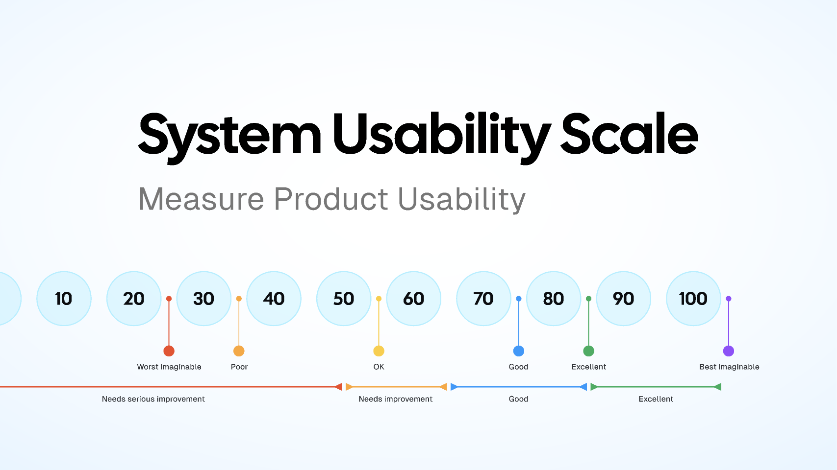
SUS questionnaire results — benchmarking perceived usability across all participants
Findings
Our research revealed that users frequently experienced uncertainty and friction when interacting with GTai Course Builder. This was largely driven by unclear labeling, insufficient guidance, and limited feedback, which increased cognitive load and reduced user confidence in completing tasks.
1. Confusion between the initial "Create New Project" buttons
Users were often unsure which button to click to start a new course or project. The labeling and placement of these options caused hesitation, slowing the workflow and sometimes resulting in users backtracking to figure out the correct starting point.
2. Confusion around template types and their meaning
When selecting templates for courses or modules, users struggled to understand the differences between options. Without clear explanations, they were uncertain which template would best fit their needs, leading to trial-and-error behavior.
3. Clearer guidance needed for distinguishing field roles
Users had difficulty understanding the purpose of different fields and roles within the platform. This lack of clarity increased the time it took to complete tasks and caused frustration, especially for first-time users.
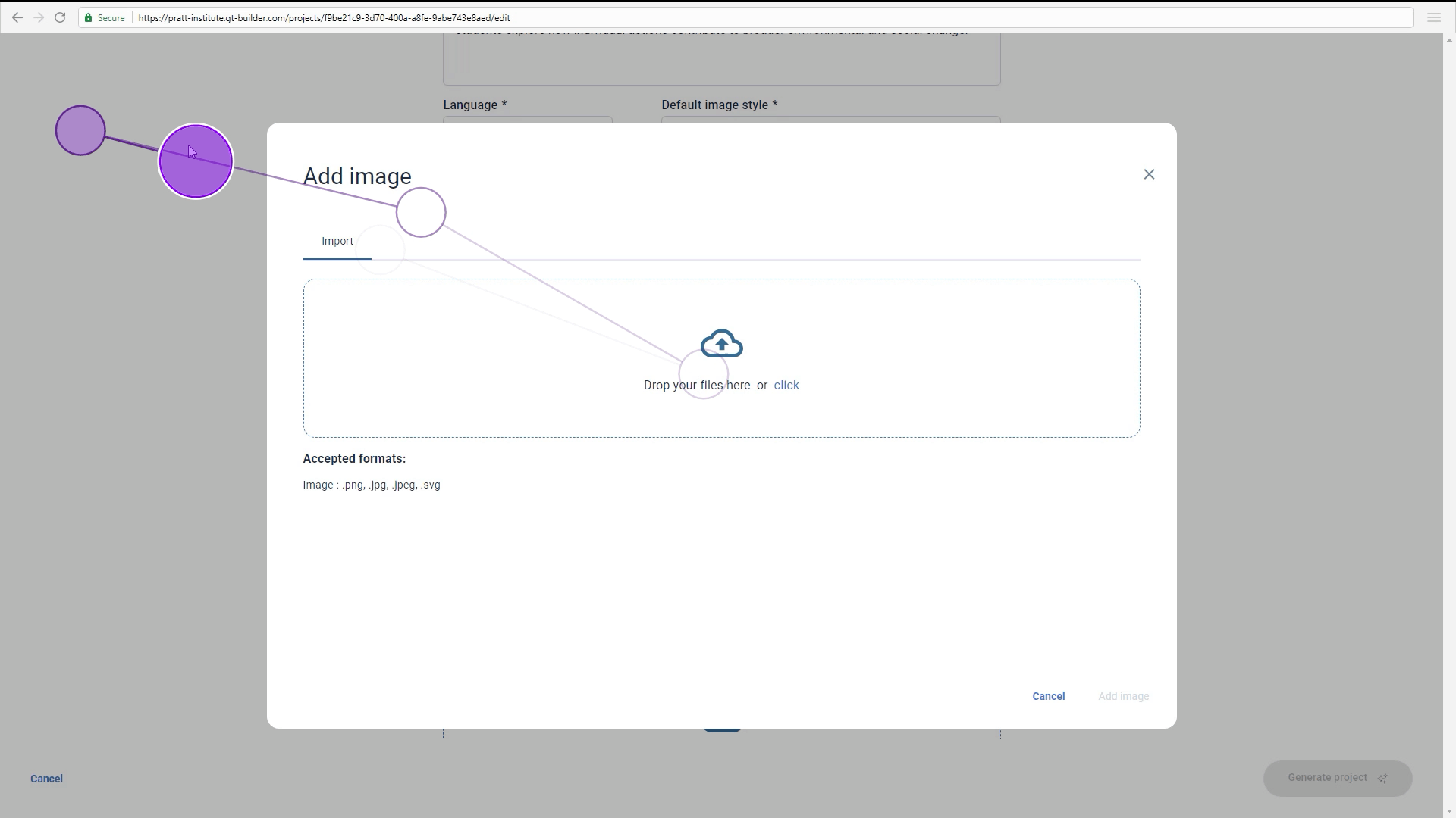
4. Confusion on initial generation of pages
During the first steps of generating course pages, users were unclear about what actions to take and what outcomes to expect. This uncertainty sometimes led to repeated attempts or incorrect task execution.
5. Lack of progress feedback during module generation
Users reported not knowing how long module generation would take or whether it was processing correctly. The absence of progress indicators caused anxiety and decreased trust in the system.
6. Uncertainty around saved work
Users were unsure whether their changes were being saved in real time or required manual saving. This uncertainty led to cautious behavior, extra checking, and reduced efficiency in completing course-building tasks.
Recommendations
Based on our eye-tracking data, behavioral analytics, and SUS scores, we developed a set of targeted recommendations aimed at improving clarity, reducing cognitive load, and strengthening user confidence within GTai Course Builder. These recommendations focus on simplifying workflows, enhancing guidance, and reinforcing feedback throughout the course creation process.
A/B testing UI language and feedback
We recommend running an A/B test to determine whether the updated UI language and new feedback mechanisms materially improve the user experience. By comparing the existing flow with a variant featuring revised button labels (such as "Edit Project Outline" and "Next: Create Pages") and a persistent "Save" status indicator, the Gutenberg team can assess their effect on user clarity, perceived guidance, and task completion rates. Conducting this experiment will provide quantifiable evidence on whether the improved terminology and micro-feedback patterns reduce ambiguity in multi-step workflows and better support users as they navigate and build within the system.
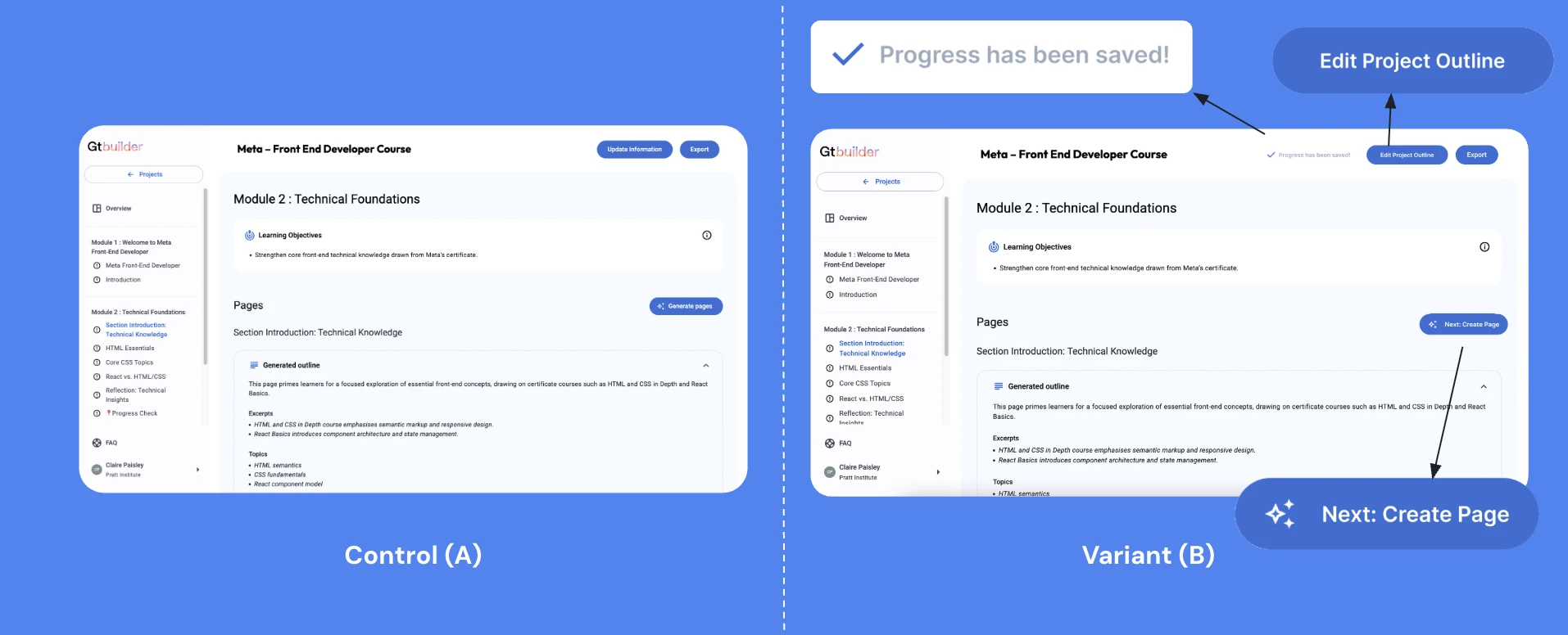
Recommendation 1 — A/B test comparing revised button labels and new feedback mechanisms
Version history
We recommend introducing a Version History feature that automatically saves previous iterations of each project or module and allows users to easily revert to an earlier state when needed. This enhancement supports users' desire to explore updates without the risk of losing prior work. During the RTA, 7 out of 8 participants expressed that when modifying a course module, they did not want to overwrite the existing content. Instead, they preferred the ability to duplicate or safeguard the current version before making edits. Incorporating Version History directly addresses this expectation by providing transparency, reducing anxiety around making changes, and strengthening user confidence in iterative creation workflows.
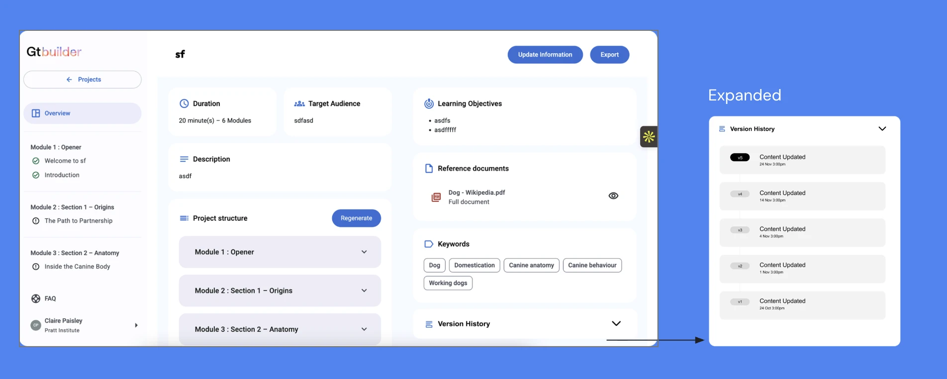
Recommendation 2 — Version History feature allowing users to revert to earlier project states
Next Steps
The most immediate next step would be validating these recommendations through iterative testing inside GTai Course Builder, starting with the highest-friction moments uncovered in the study. That includes clarifying entry points, improving template comprehension, and making system status more legible during content generation.
I would also expand the feedback layer across the product so users have stronger reassurance around what the system is doing, what has been saved, and what actions are expected next. Small cues like progress indicators, persistent save states, and clearer transition messaging could significantly reduce uncertainty during complex workflows.
Longer term, this work could evolve into a more comprehensive design system for AI-assisted course creation, where guidance, transparency, and control are treated as foundational UX principles rather than reactive fixes. That would help Gutenberg scale the platform with greater consistency as new AI capabilities are introduced.