Overview
Kinra is a self-initiated product that brings collection management, market context, grading, and trade records into one calm companion for collectors. I took the product from an open-ended idea to a native iOS app: researching the collector workflow, defining the information model, designing and testing the interface, building the backend, integrating market providers, and preparing the product for the App Store.
Introduction
Collectors often move between marketplace listings, spreadsheets, screenshots, grading lookups, notes, and memory just to answer a simple question: What do I own, and what is it worth?
The difficulty is not only finding a price. A single card can represent multiple positions depending on condition, finish, language, quantity, or grade. A sealed item behaves differently from a raw card. A completed trade changes both inventory and realized performance.
Kinra began as an attempt to give this fragmented workflow the clarity of a financial portfolio without stripping away the nuance that makes collecting personal.
How might we make a collection feel as legible as a portfolio while preserving the identity and context of every item?
Research & framing
I began with a comparative audit of collection apps, marketplaces, grading tools, spreadsheets, and the language collectors use when documenting a purchase or trade. I mapped the recurring jobs across an item's life: discovery, acquisition, cataloging, monitoring, grading, trading, and eventual exit. This made one thing clear: price was only one part of the truth.
The research exposed a gap between marketplace products and portfolio products. Marketplaces optimize for a listing; collectors think in positions. The same card may exist as raw Near Mint, raw Lightly Played, Japanese, reverse holofoil, or a PSA 10 with a unique certification number. Treating these as one record creates misleading values and unreliable history.
That shifted the problem from displaying prices to maintaining identity. Market context also needed to communicate freshness and uncertainty without false precision. Trades had to behave as portfolio events, updating outgoing items, incoming items, cash, cost basis, and realized performance together.
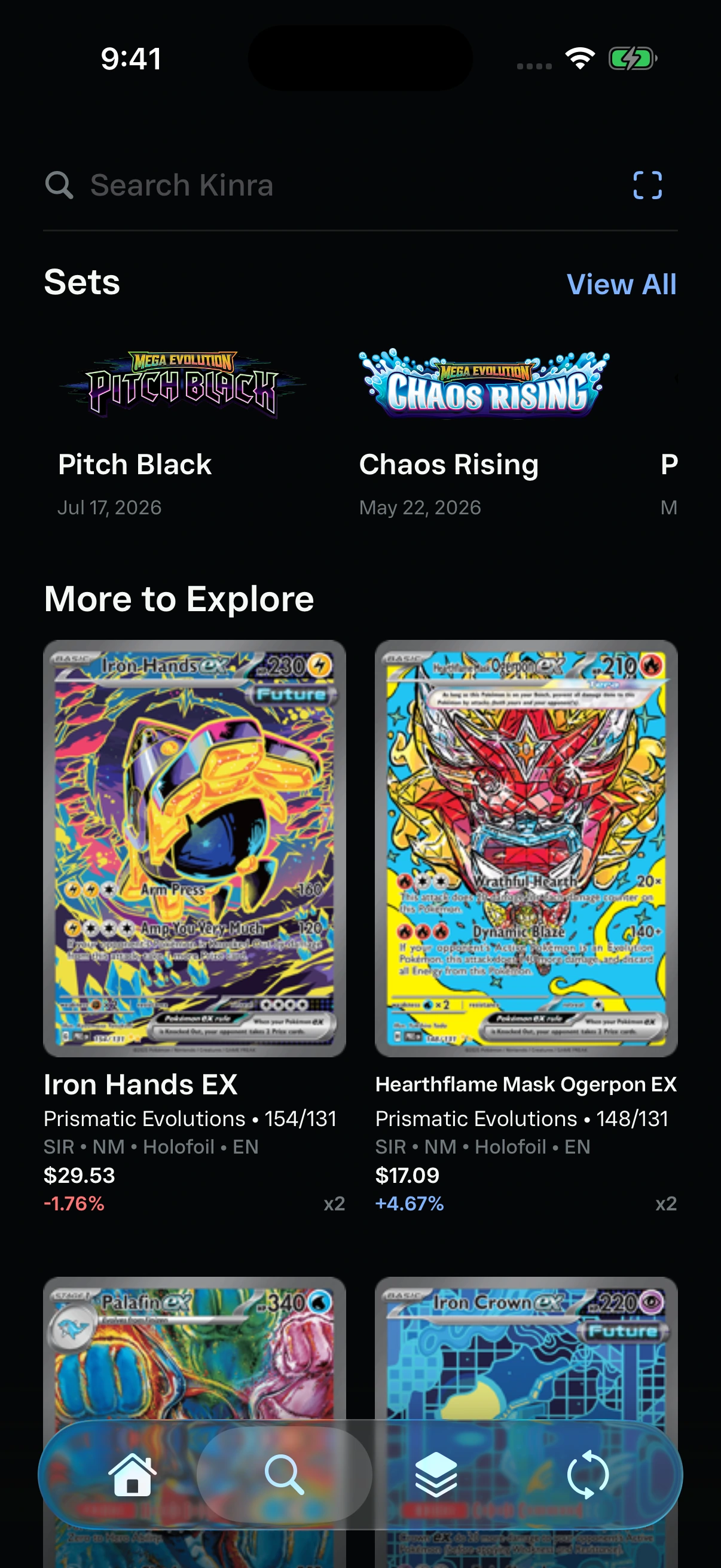
Browse sets and discover cards through More to Explore.
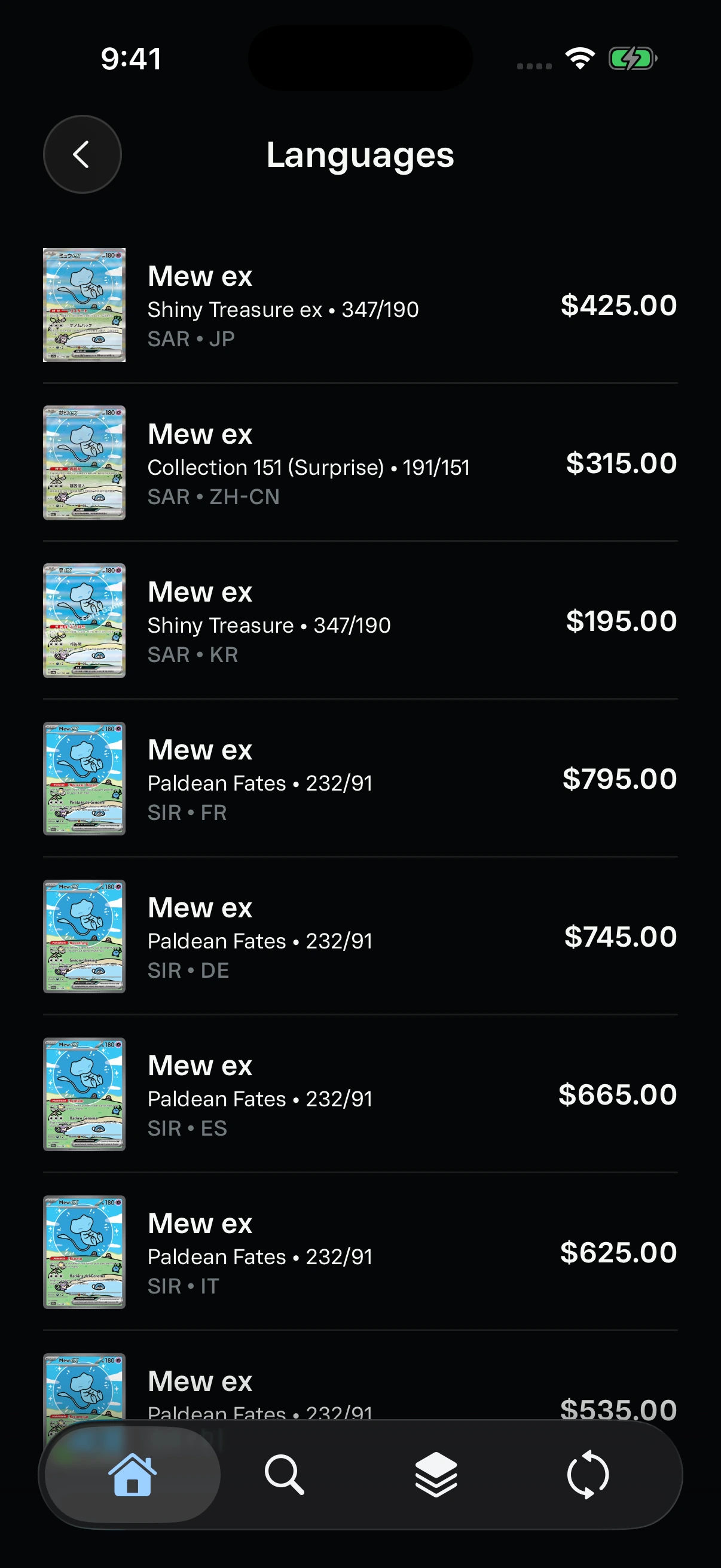
Verified language counterparts preserve the identity of the same artwork.
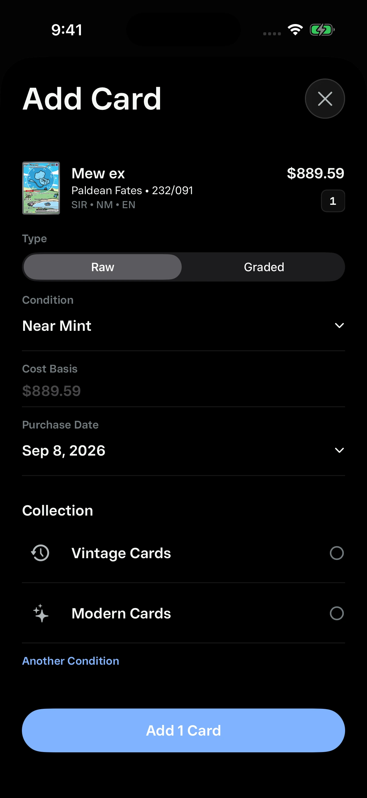
Add a position with its condition, cost basis, purchase date, and collection.
My workflow
I worked in vertical slices rather than designing the entire product before building it. For each core job, I mapped the user decision, defined the minimum data contract, prototyped the interaction, built it in SwiftUI, and tested it with realistic inventories and failure states. That kept the interface and the underlying system evolving together.
The loop was research, model, prototype, build, observe, and refine. Visual QA in the simulator exposed hierarchy and motion issues; seeded portfolios exposed performance problems that small test accounts hid; backend logs exposed identity mismatches and provider failures that looked like UI bugs. Each pass informed both design and engineering decisions.
I kept a shared design system for type, spacing, metadata, toolbars, sheets, charts, empty states, and motion. Reusing those rules let the product expand into search, sets, grading, trades, scanning, and subscriptions without each feature becoming its own visual dialect.
Product principles
Collector-native identity: condition, finish, language, grade, certification, and quantity are first-class data rather than footnotes.
Progressive market detail: lead with the value a user needs now, then reveal ranges, sources, and deeper analysis when requested.
Actions have consequences: grading and trades visibly change the underlying portfolio instead of living as disconnected tools.
Speed communicates quality: cached metadata appears first while images, prices, and graphs progressively hydrate without blocking navigation.
Iteration
The early direction leaned heavily into dark finance conventions. It established credibility and density, but it also made the product feel like a trading terminal placed on top of collecting.
I reduced persistent controls, removed low-value summary metrics, simplified navigation, and shifted to a brighter hierarchy where item imagery and portfolio consequences could lead. The result felt calmer, faster, and closer to how collectors actually scan a binder or shelf.
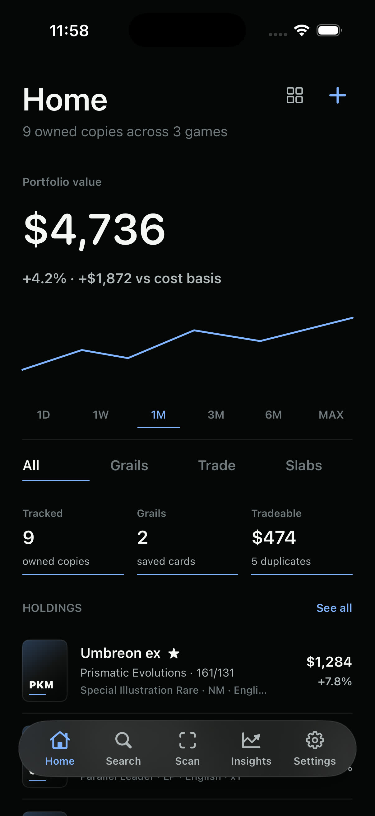
Early direction: dense, market-forward, and visually heavy.
The hierarchy moved from metrics-first to portfolio-first.
One system, two appearances
Kinra follows the collector's chosen appearance without changing information hierarchy, contrast, or the prominence of card imagery. Light and dark modes use the same spacing and component system, so switching appearance feels continuous rather than like entering a different product.
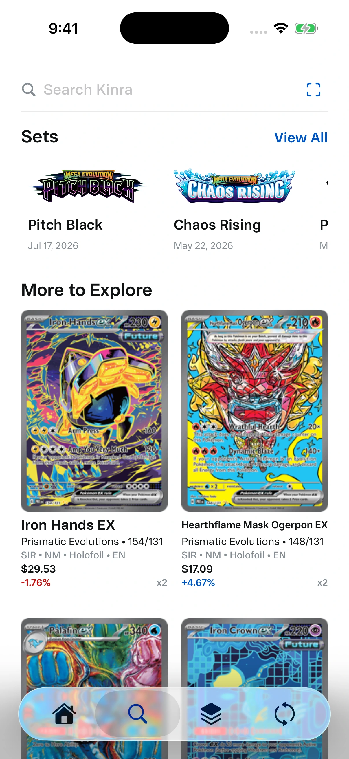
Drag vertically to compare appearances
The same native Search screen rendered in both appearances. Drag the divider to compare.
Product system
The central design decision was to treat each holding as a specific market identity rather than a loose card name. The same system supports raw cards, slabs, sealed products, multiple languages, and different conditions without changing the interface model from screen to screen.
Market data also had to feel immediate without becoming fictional. Kinra renders cached metadata and values first, then refreshes visible content in the background. Provider calls remain behind the backend, where requests can be deduplicated, rate-limited, and stored. Production historical graphs render only when real dated points exist. The updated screens shown here were captured from the September 2026 simulator build; market prices, histories, and language prices use design-preview data.
Portfolio
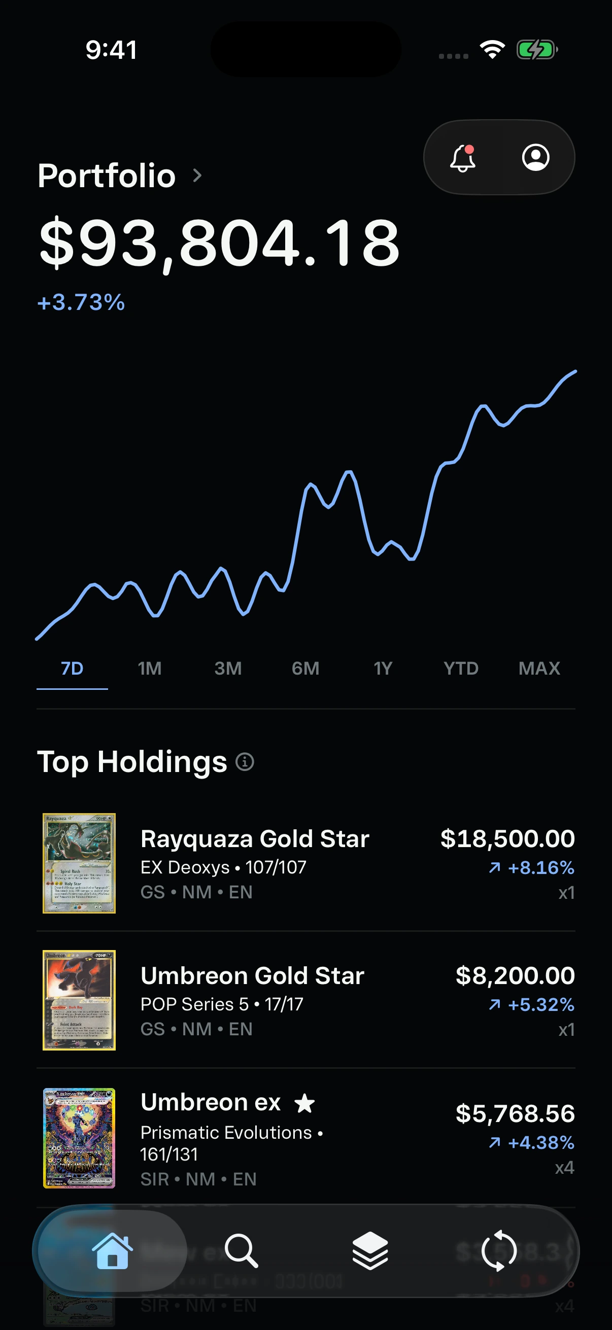
The home screen prioritizes total value, historical movement, and the user's most valuable holdings. Collections and watchlists remain visible without competing with the primary portfolio story.
Portfolio value, movement, and top holdings share one clear hierarchy.
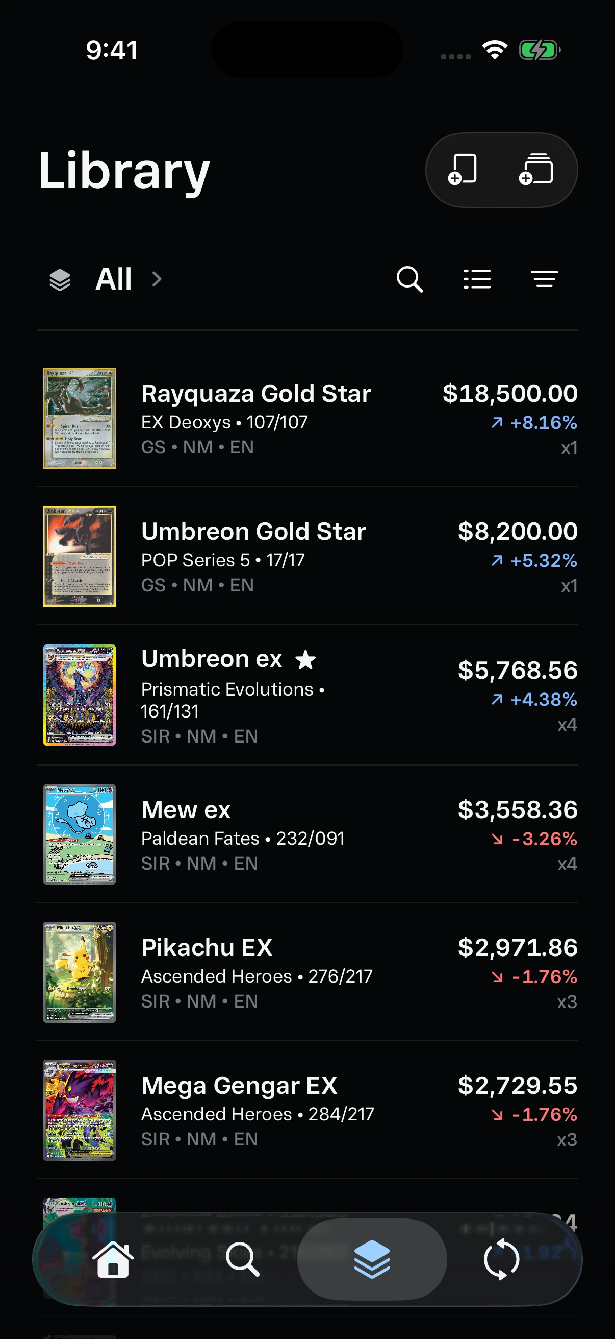
The list keeps value, quantity, condition, and language easy to compare.
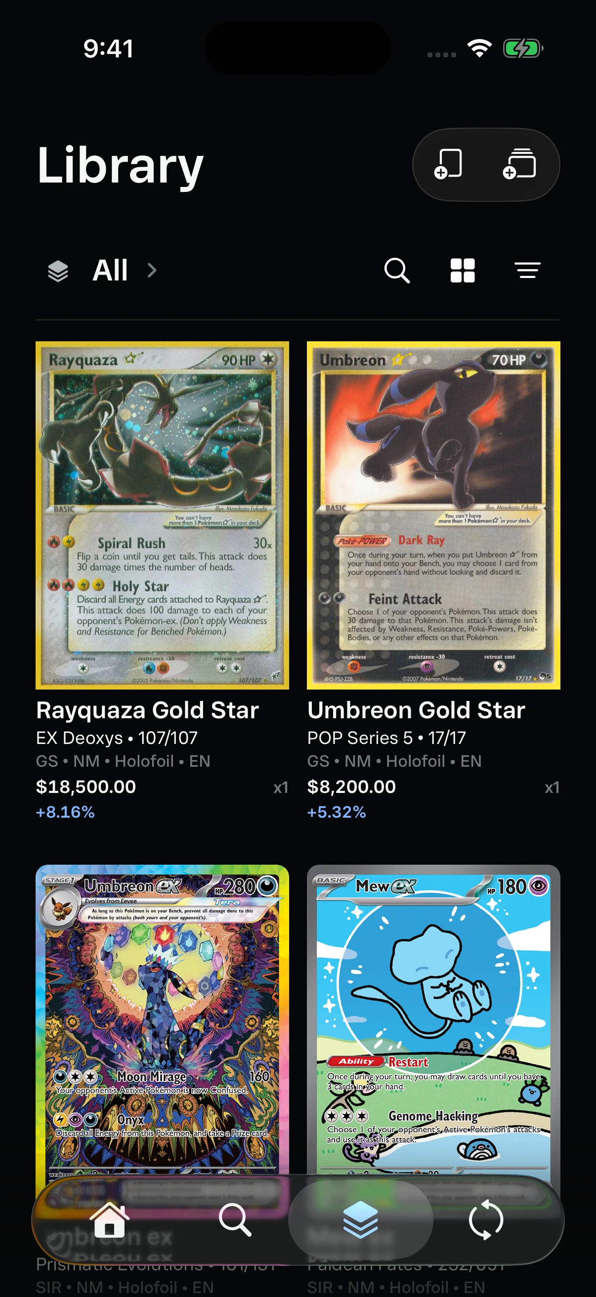
The grid gives card artwork more space while retaining position metadata.
Search & detail
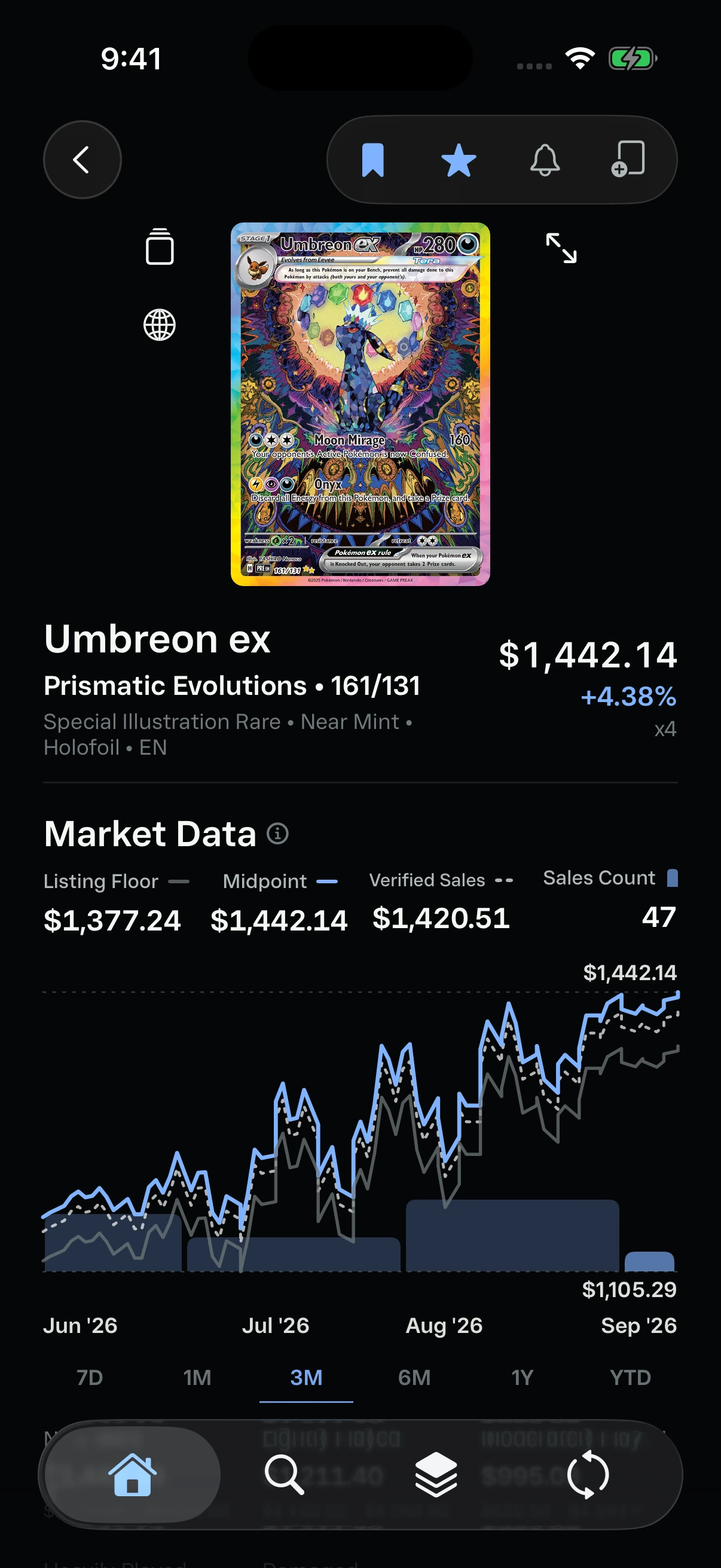
Search supports both directed lookup and market discovery. Set discovery and More to Explore pair card artwork with concise identity, value, and movement information. Detail then resolves the exact item, position, and market context. Users can inspect condition values and history without losing the card itself as the primary object.
Set discovery and More to Explore support browsing before a query.
Umbreon ex: price history, listing floor, verified sales, and monthly sales volume.
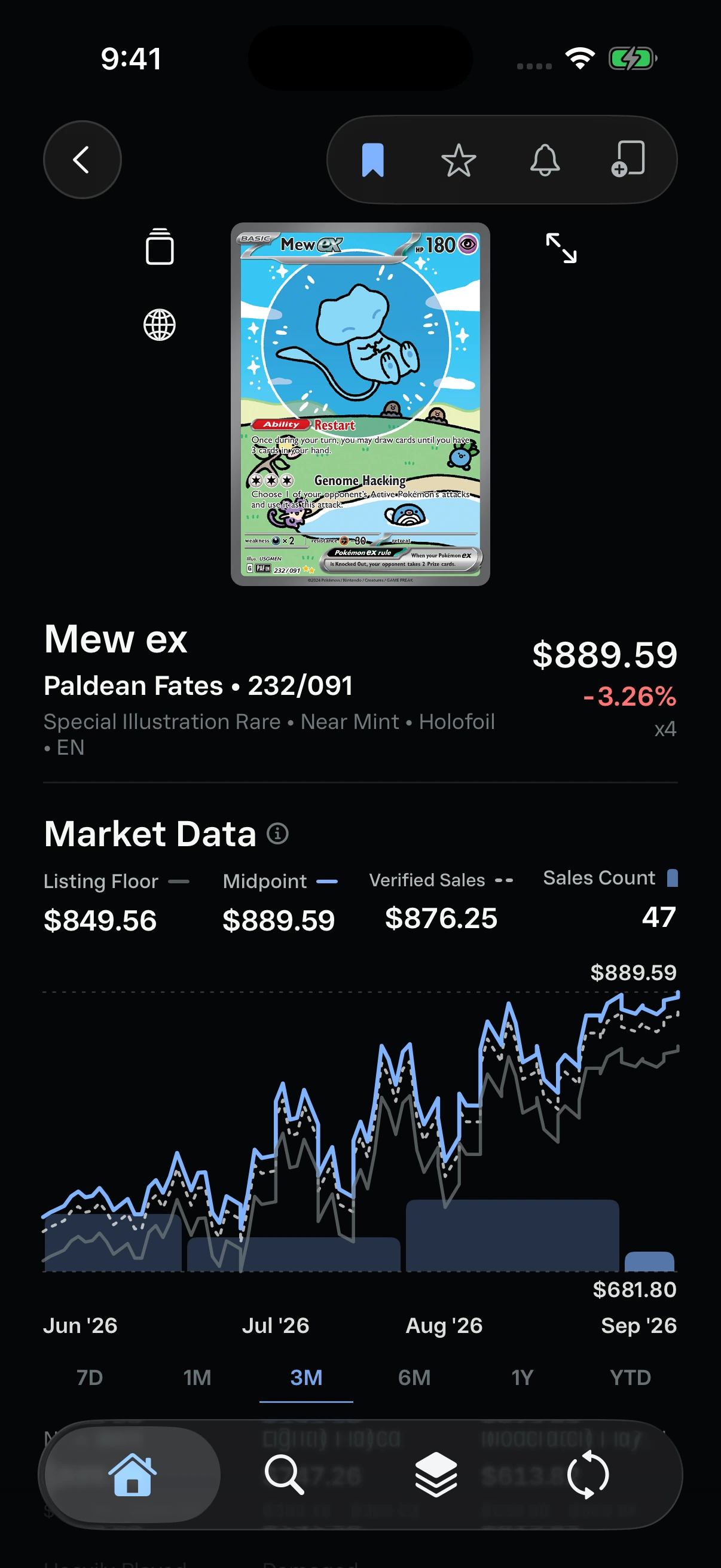
Mew ex uses the same detail hierarchy and three-month market view.
From price to position
A chart is only the starting point. Condition and grade values lead into the collector's quantity, cost basis, allocation, and unrealized gain. The market snapshot then adds listing depth, comparable sales, returns, liquidity, and confidence without collapsing them into one unexplained price.
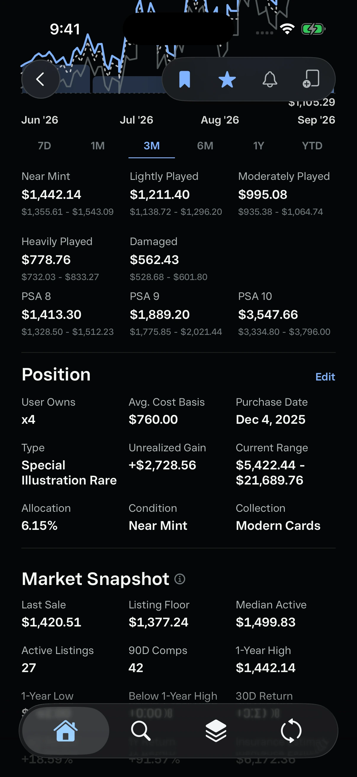
Umbreon ex: condition and grade pricing alongside the owned position.
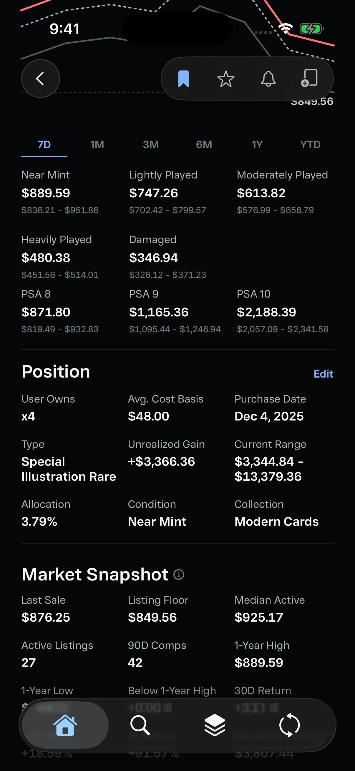
Mew ex: quantity, cost basis, allocation, and unrealized gain.
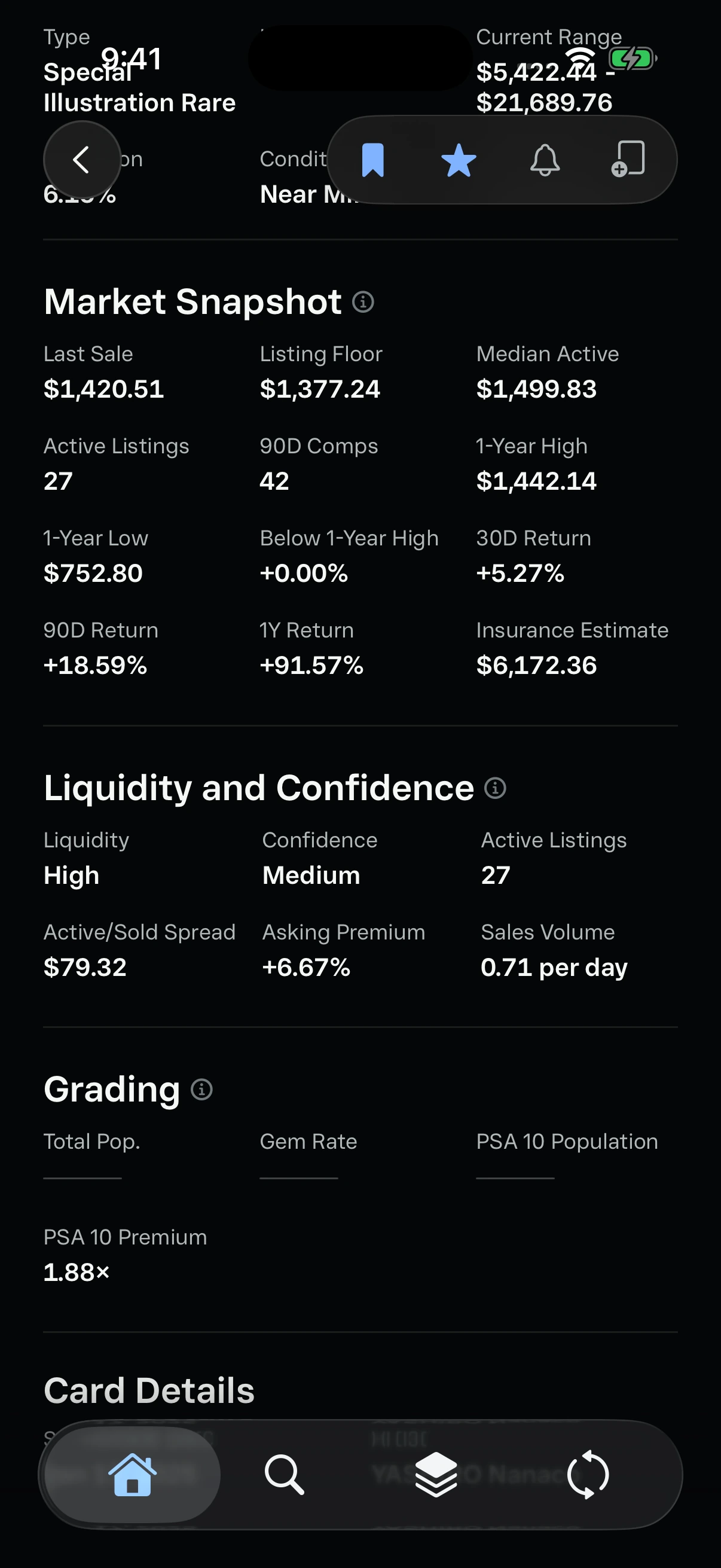
Umbreon ex: market depth, returns, sales volume, and confidence.
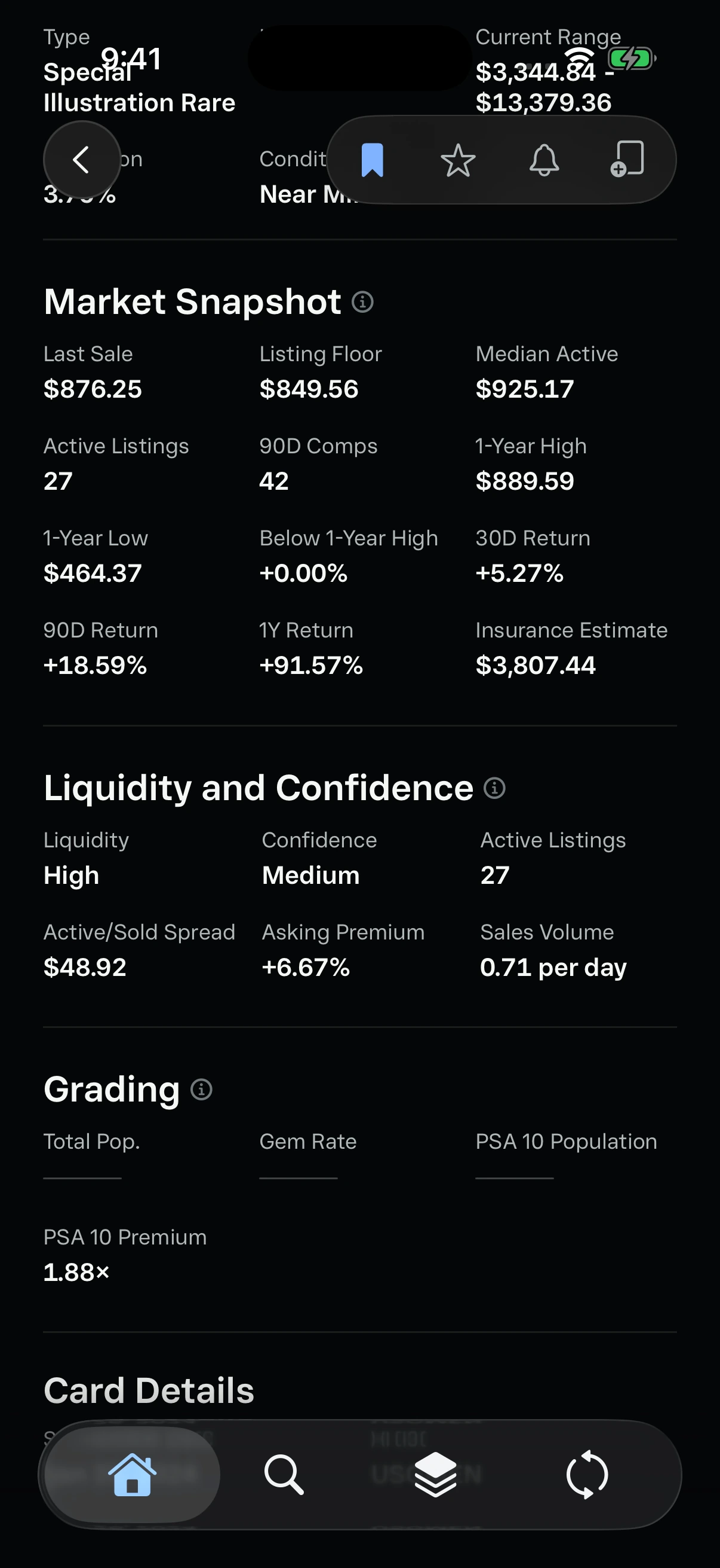
Mew ex: the same metrics make the two card positions comparable.
Identity at every level
A collector may approach the same object through a set checklist, a language variant, a full-art inspection, or a certified slab. Kinra keeps these views connected through one identity model instead of relying on a card name alone.
Set Overview combines owned and missing cards in release order. Fullscreen viewing removes market UI when the artwork is the task. PSA positions replace raw condition and quantity with grade and certification, preserving the fact that every slab is a unique asset.
Mew ex counterparts show their own set, number, language, and price.
Condition, acquisition cost, and collection are recorded when adding a card.
Trade
Trade compares what leaves and enters the portfolio, supports cash and notes, and records who the trade was with. Confirmation turns the analysis into an actual portfolio event instead of leaving it as a standalone calculator.
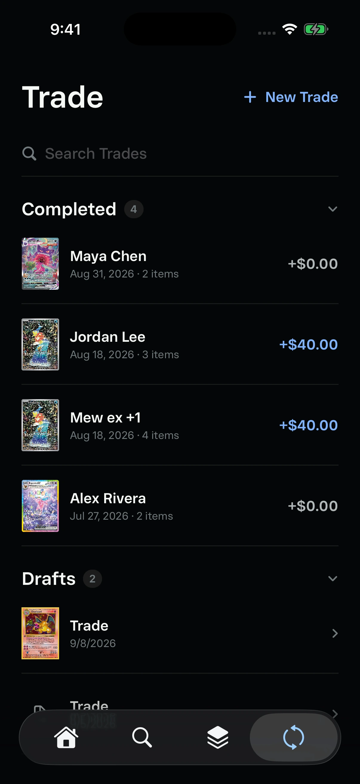
Completed trades and drafts share consistent row sizing and card thumbnails.
Collector workflows
Opening Sessions, grading, scanning, alerts, and collection tools recognize that ownership is not static. These workflows preserve cost, identity, and outcome as an item changes over time.
Controls in context
Dropdowns keep choices close to the content they affect. Collectors can change portfolio scope, switch the Library layout, sort holdings, or choose a card condition without losing their place.
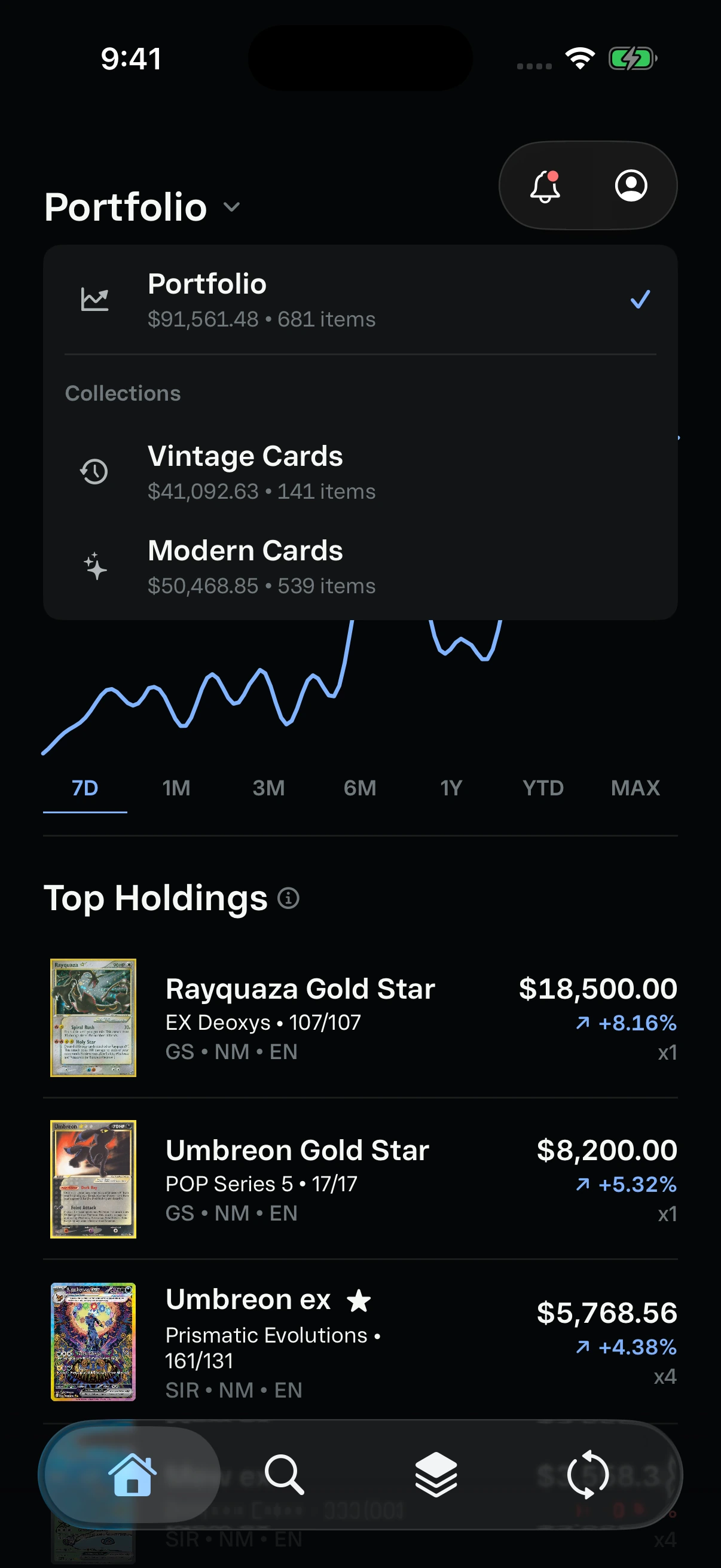
Switch between the full portfolio and individual collections.
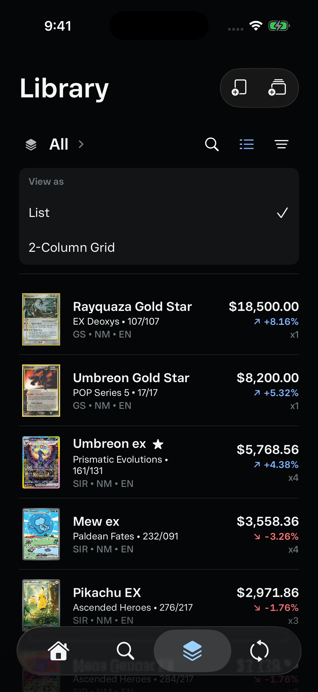
Choose a compact list or a two-column artwork grid.
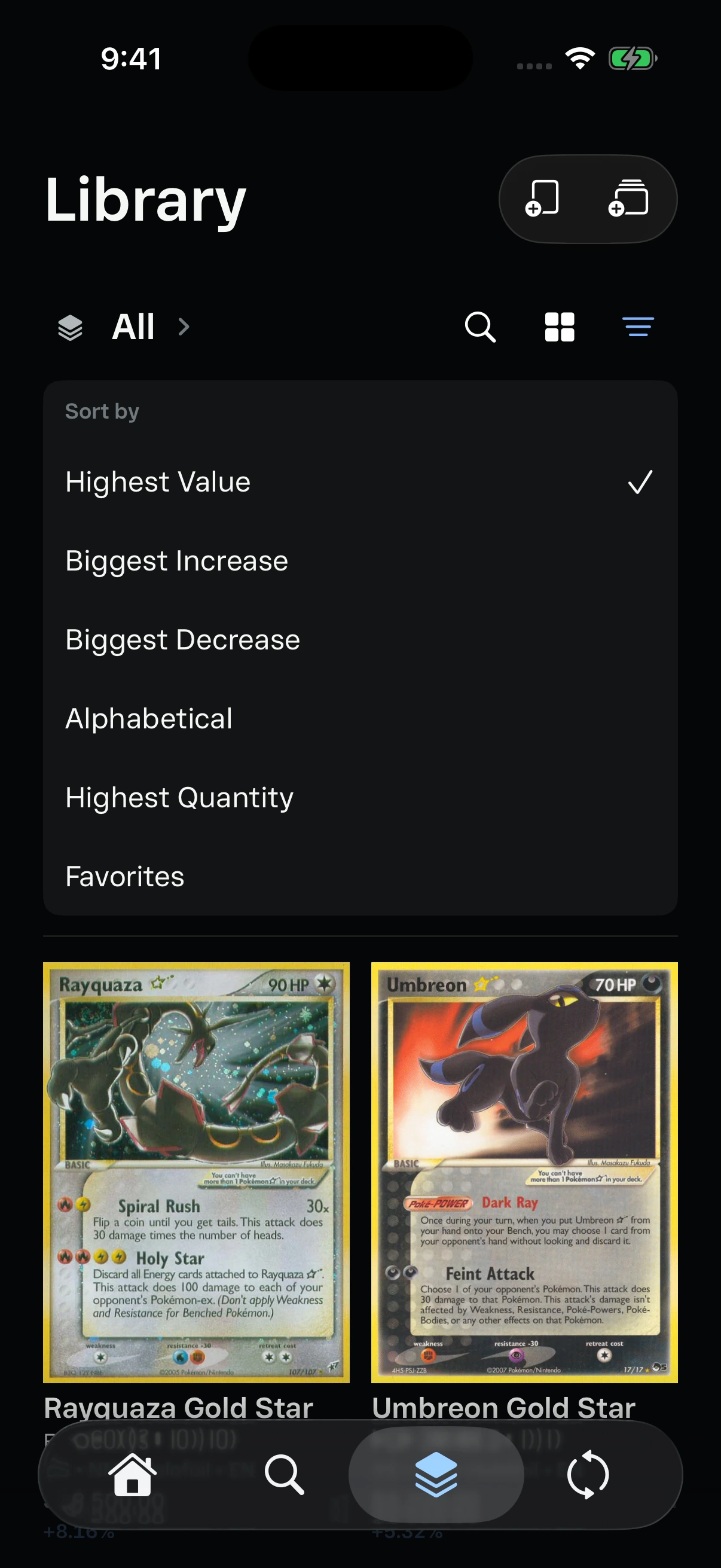
Sort by value, movement, name, quantity, or favorites.
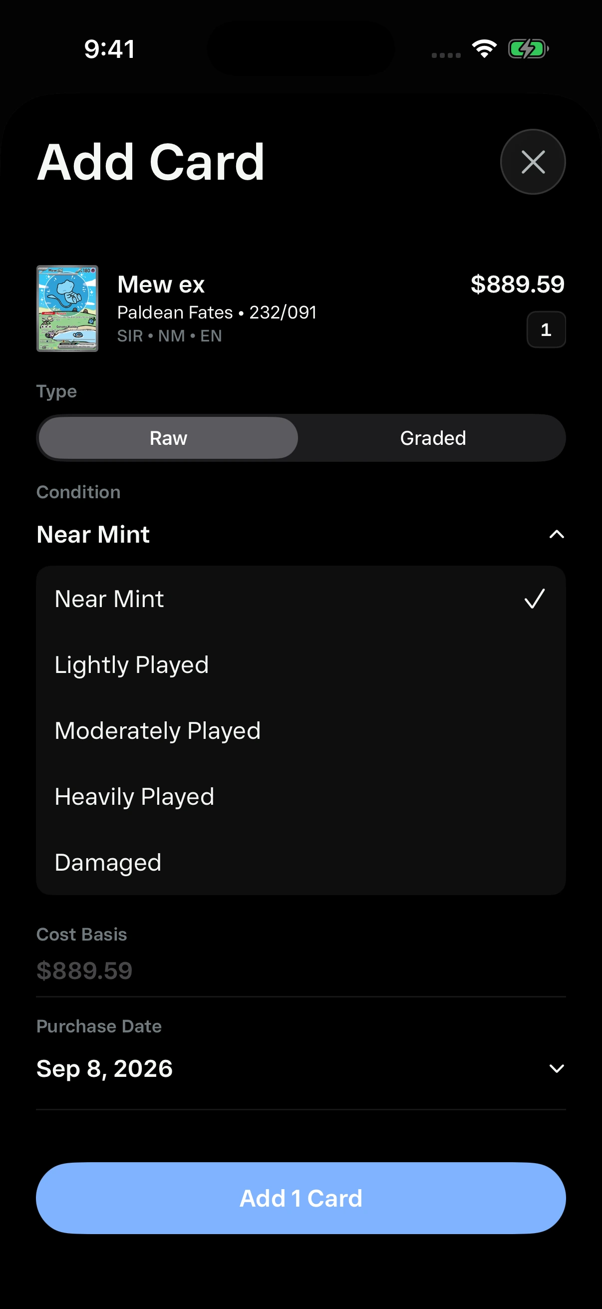
Choose a condition inline while keeping the card and purchase details in context.
Shipping the product
Because Kinra is a working native product rather than a static prototype, the final experience depended on decisions beyond the screen. I built the iOS app in SwiftUI and paired it with a backend for accounts, cross-device sync, market caches, durable refresh jobs, and protected provider access.
Backend-backed authentication preserves libraries, collections, trades, watchlists, and settings across devices. Cache-first requests and scheduled workers keep expensive provider calls away from navigation and scrolling. StoreKit powers Kinra+, while Datadog instrumentation, privacy disclosures, screenshots, and reviewer flows supported the App Store submission.
What 0–1 taught me
Building the entire system changed how I think about product design. A polished screen can hide an unstable contract, and an accurate API can still create a poor experience if it blocks navigation. The most important work often happened between layers: deciding what identity the client sends, what the backend normalizes, what gets cached, and what the UI can honestly claim when a provider is slow or incomplete.
External APIs are not product foundations by themselves. Providers disagree on names, sets, languages, finishes, conditions, and historical coverage. I learned to treat each one as an adapter behind Kinra's own model, keep credentials and rate limits on the backend, cache the last trustworthy response, and show a clear unavailable state instead of inventing precision.
I also learned that performance has to be designed early. A thousand-item portfolio exposed broad SwiftUI recomputation, oversized image decoding, row-by-row requests, and background work competing with navigation. Stable view models, visible-item hydration, batched requests, image sizing, cancellation, and durable workers became product decisions because they directly shaped trust.
Finally, 0–1 work requires ruthless coherence. Every new workflow creates pressure to add another control, metric, or special case. The strongest iterations came from removing repeated information, reusing existing patterns, and making the data model absorb complexity so the interface did not have to.
Outcome & reflection
Kinra reached a production App Store build with a coherent portfolio, search, library, set, grading, trade, account, and subscription experience. It remains an active product rather than a finished concept: each new data source and collector workflow is evaluated against the same identity, clarity, and performance standards.
Precision beats volume. Showing fewer, better-matched data points is more useful than filling every state with an estimate. Performance is part of trust: a correct price that arrives after a blocked screen still feels unreliable. Collector language matters too—small choices such as items instead of cards, average value instead of a misleading range, and grade instead of condition for slabs made the system feel native to the community.
The next chapter is less about adding more surfaces and more about strengthening the intelligence underneath them: better identity matching, broader market coverage, and richer portfolio health signals without sacrificing clarity.